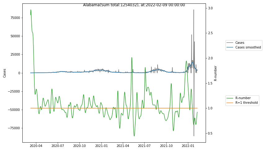
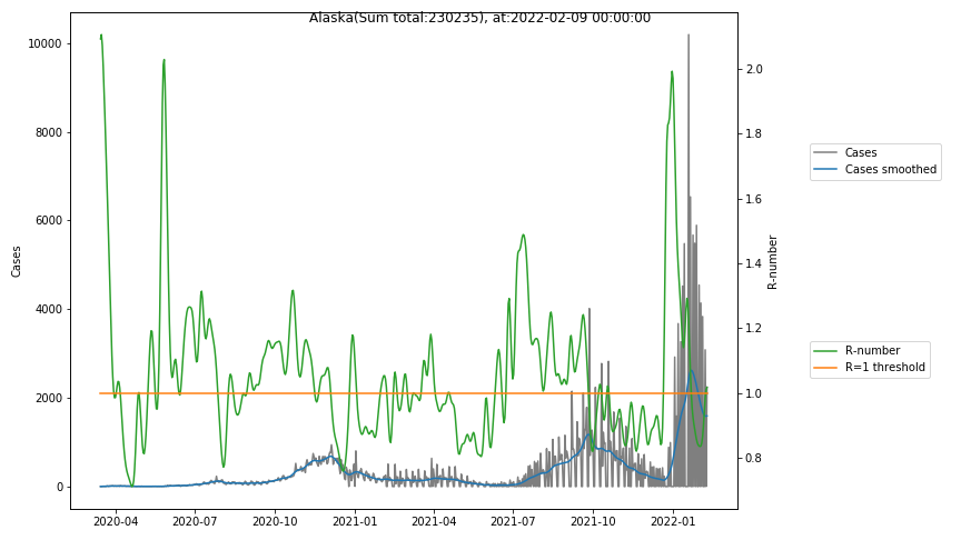
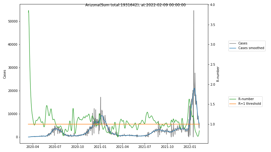
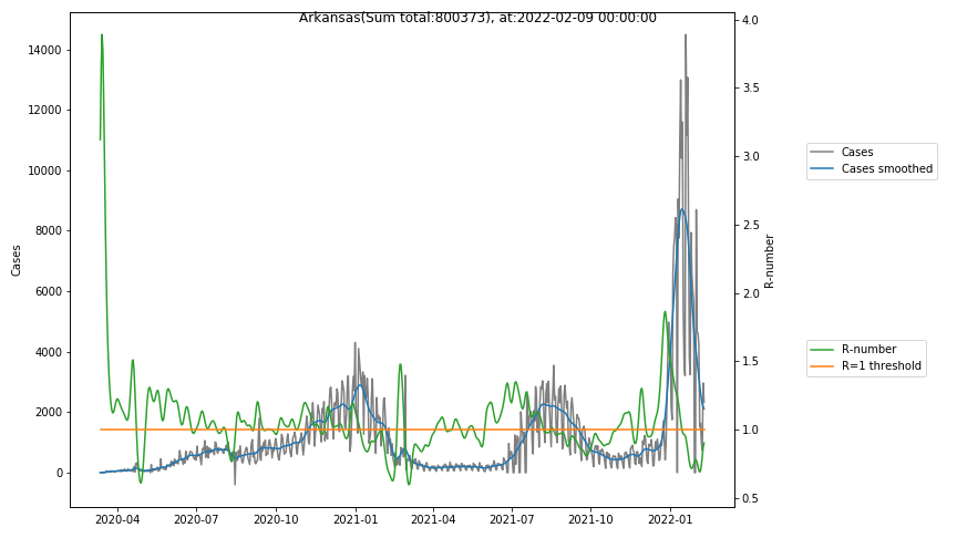
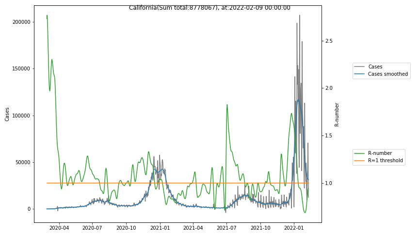
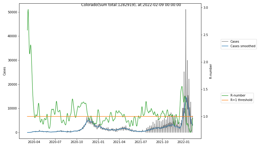
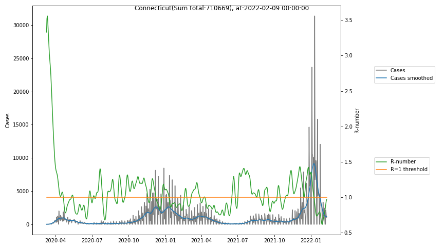
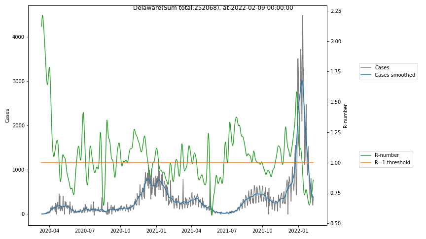
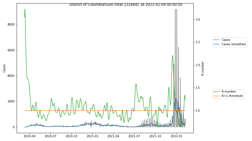
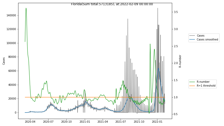
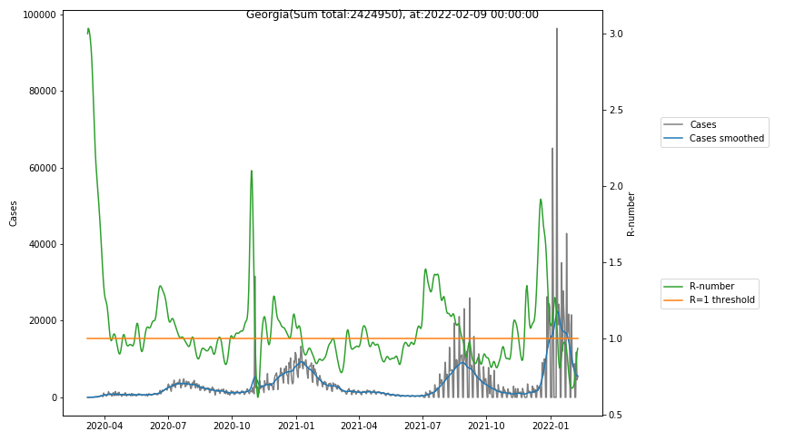
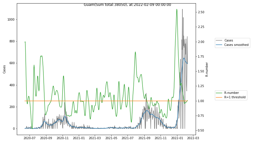
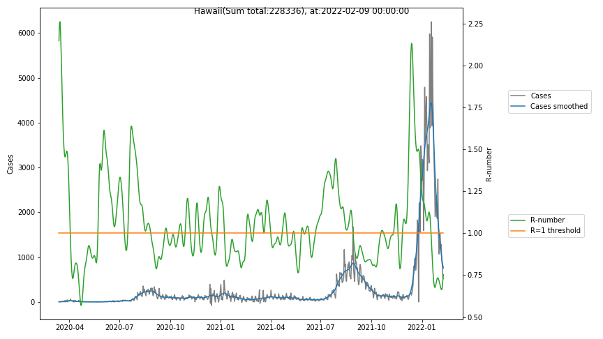
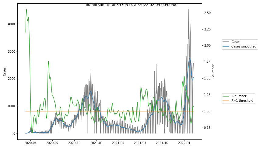
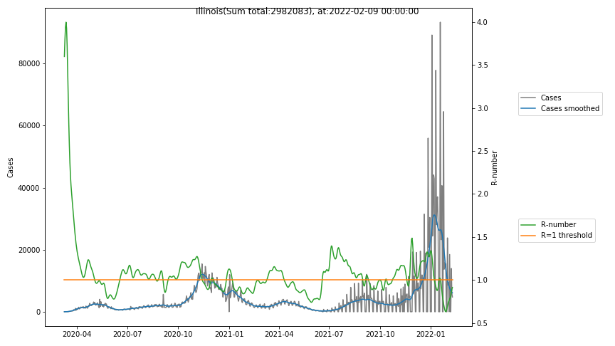
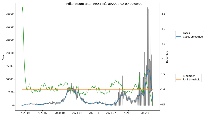
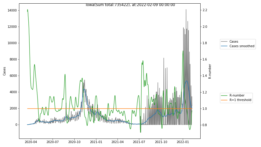
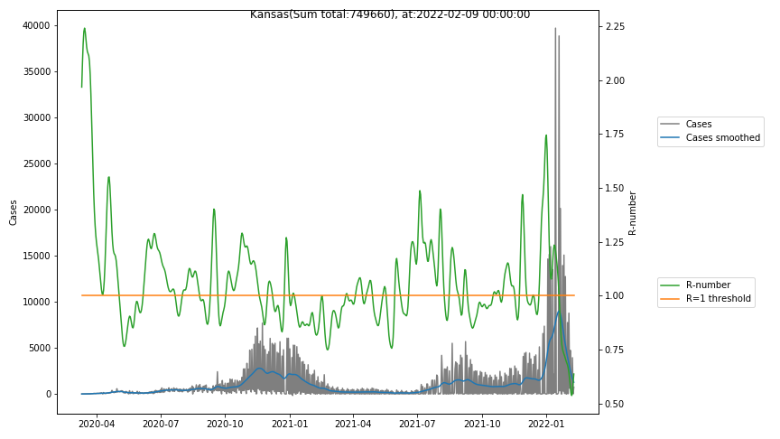
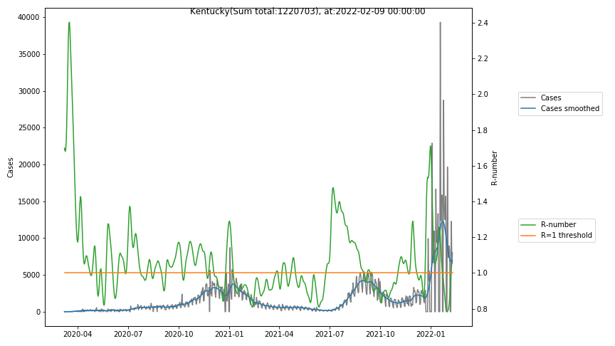
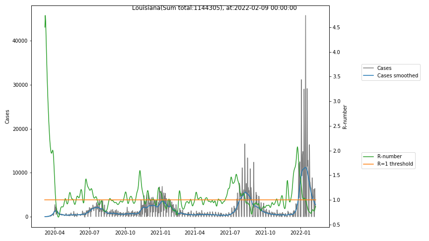
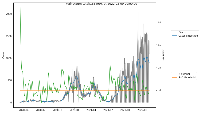
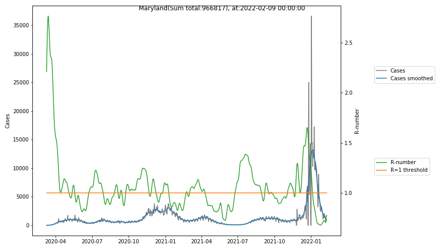
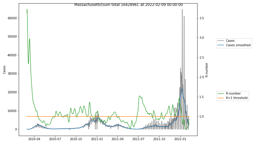
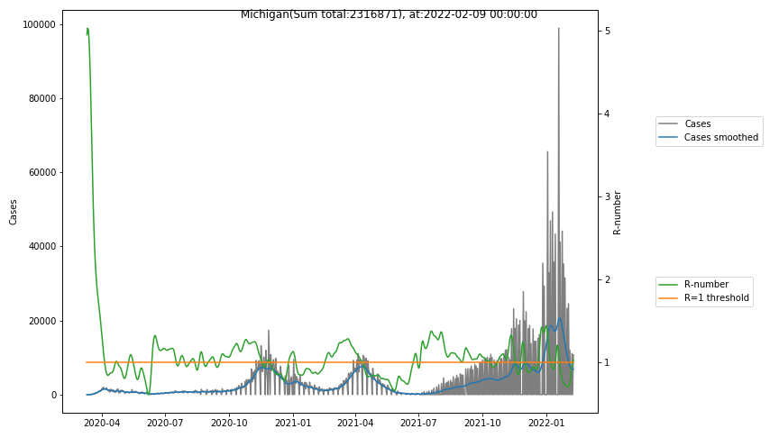
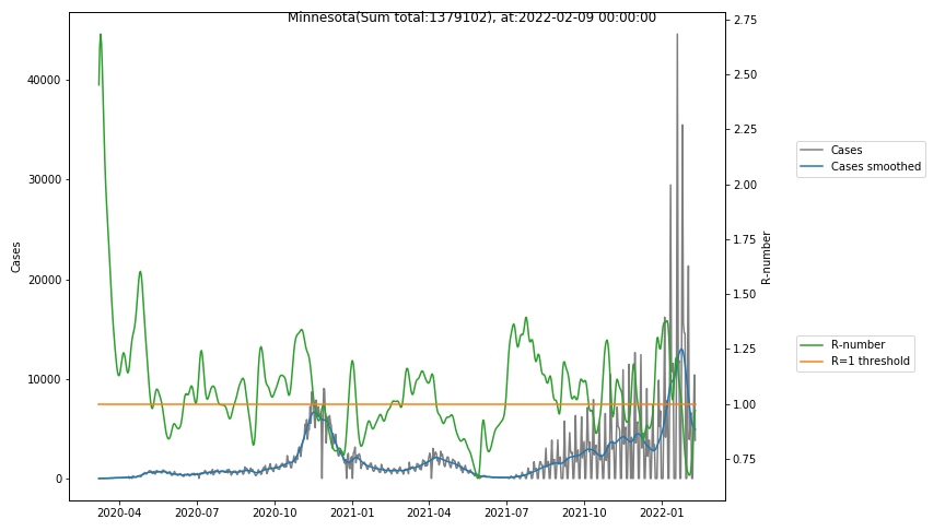
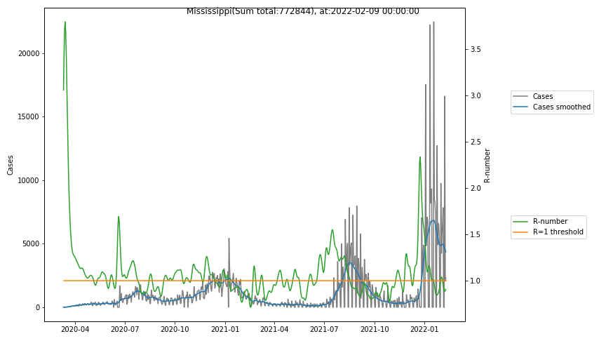
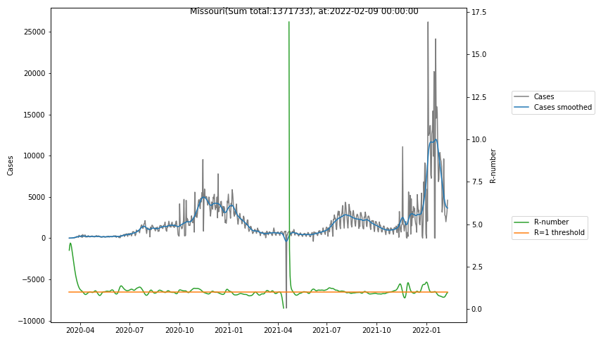
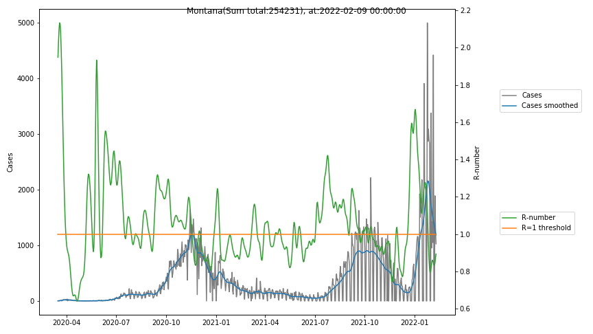
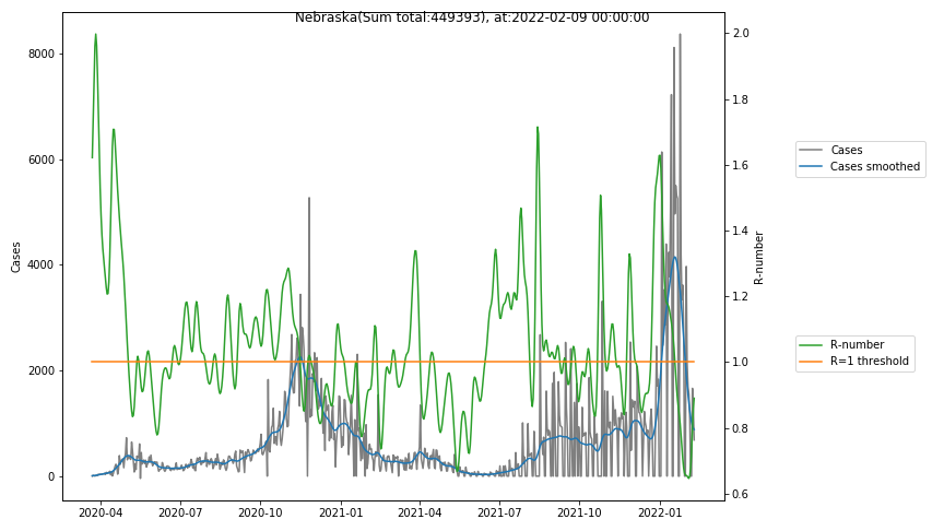
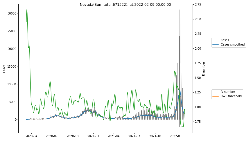
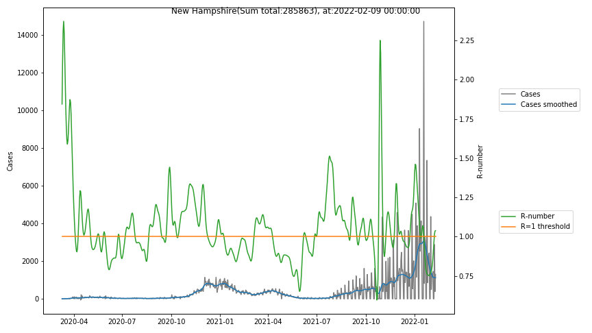
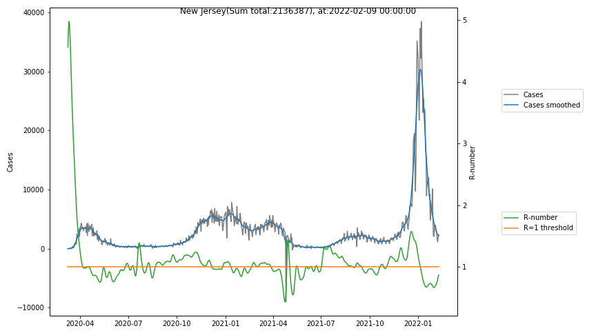
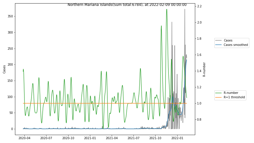
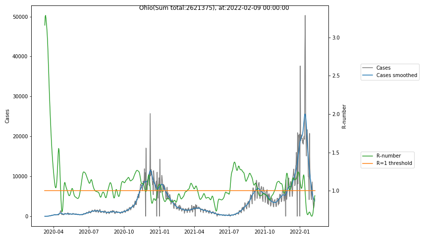
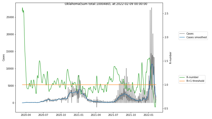
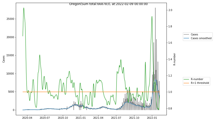
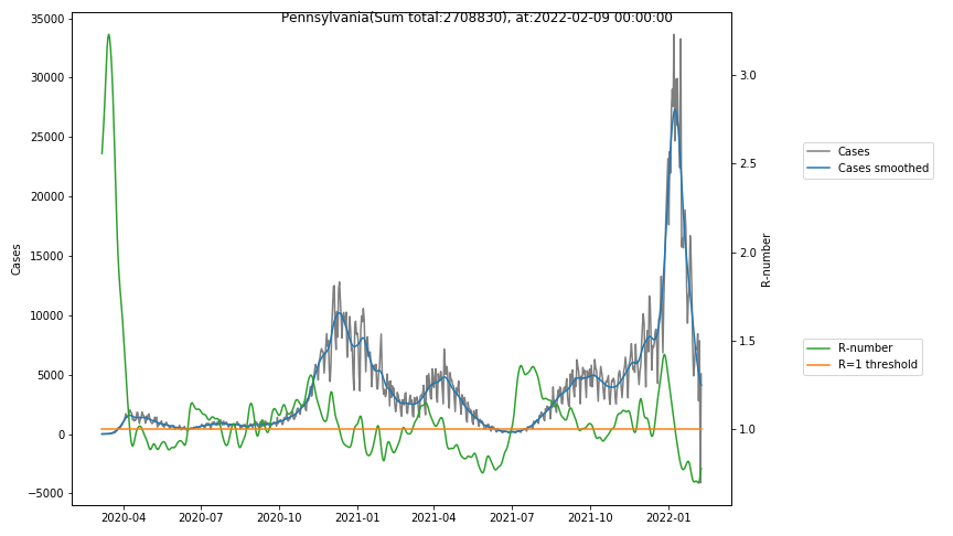
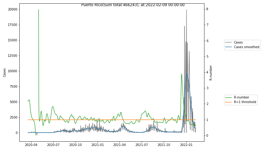
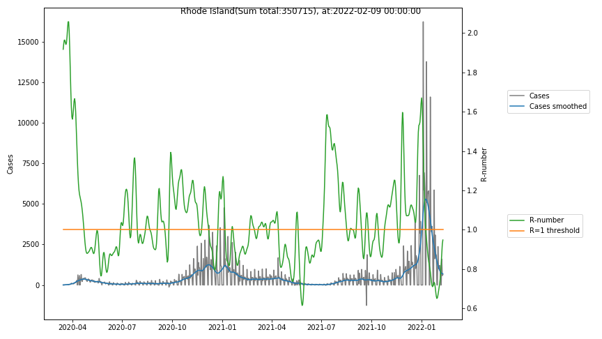
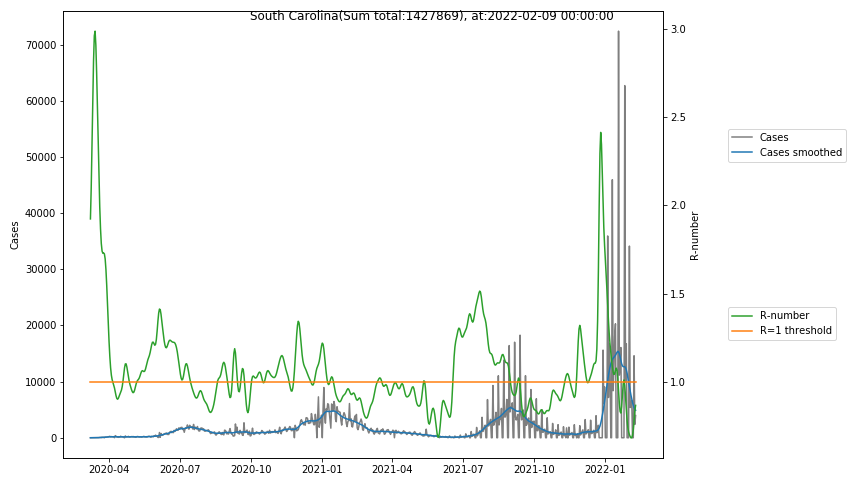
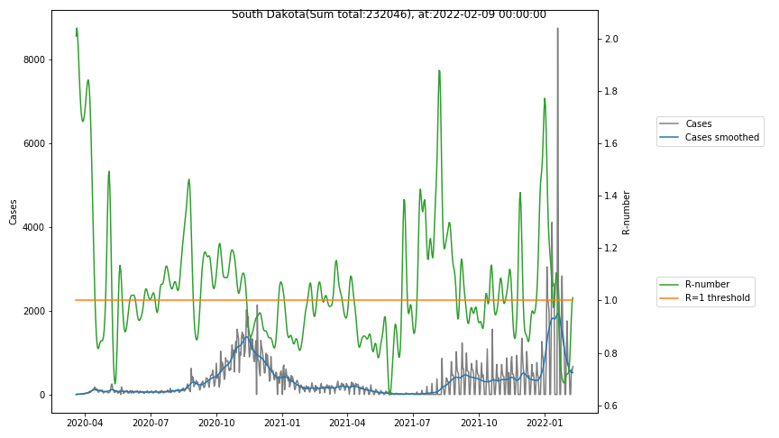
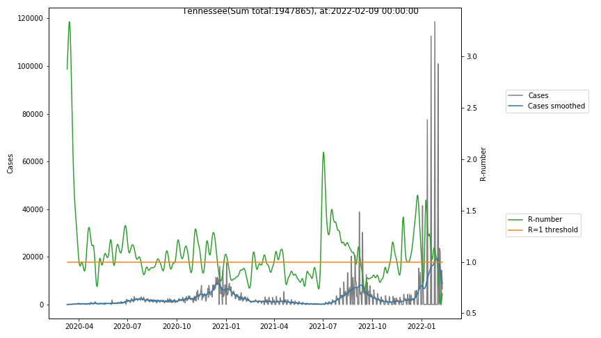
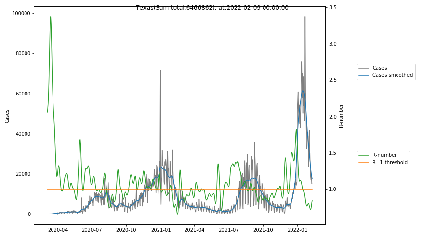
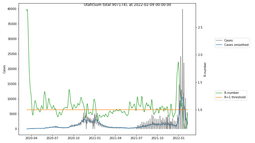
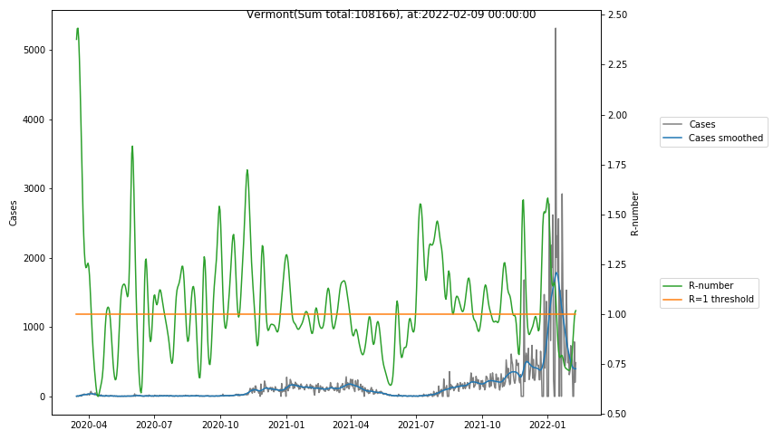
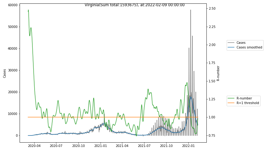
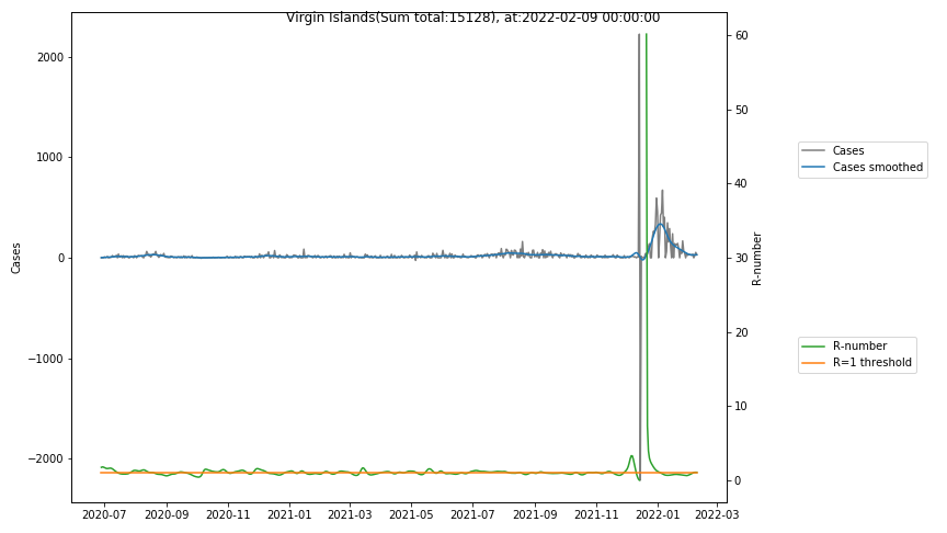
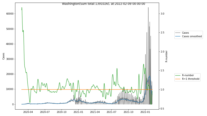
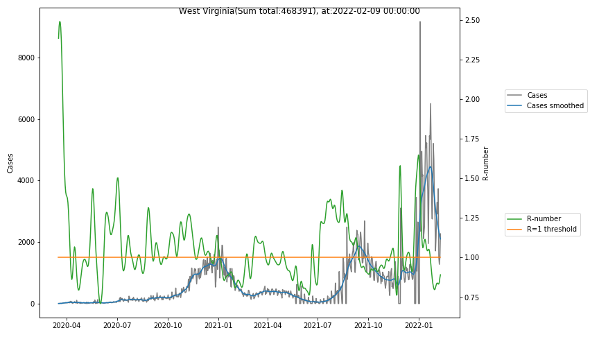
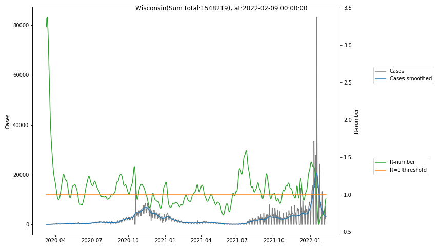
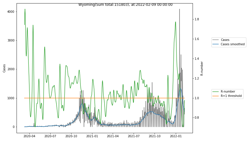
The following graphs show the Covid-19 cases in the United States, analyzed with the evaluation methods described in this blog.
The data source are the daily data from the COVID-19 Data Repository by the Center for Systems Science and Engineering (CSSE) at Johns Hopkins University.
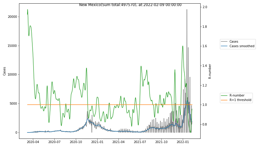
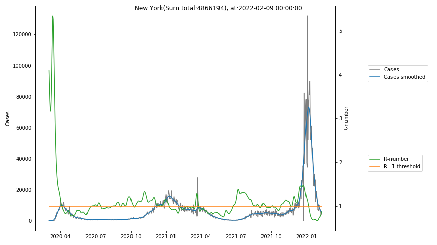
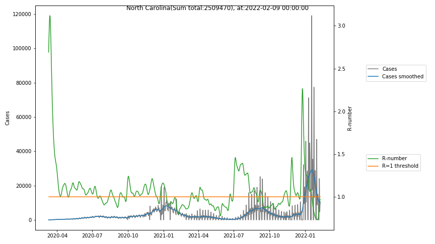
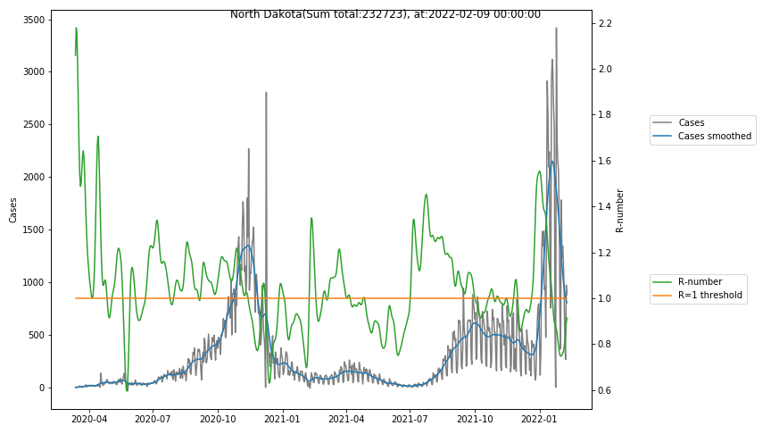
Here for each state the following data are shown:
- The raw case numbers (gray),
- the smoothed case numbers, eliminating most of the noise and variability due to e.g. weekends (red),
- the computed Reproduction number (green), which is the only variable that can be directly influenced by policies or behaviour. Once this is below 1, the epidemics is dying out. The actual case numbers cannot be directly influenced, only the rate of infection, which is controlled by the Reproduction number.
A further advantage of the Reproduction Number is that it is much less sensitive to growing test numbers as the actual case numbers. With the realistic assumption of linearly growing test numbers of 200000/month, this is reflected in a (logarithmically decaying) offset of the Reproduction Number, at the beginning of May the offset was 0.1, currently it is 0.05. Practically this means that the actual Reproduction Number is 1 when the measured Reproduction Number is 1.05.
The Reproduction Number can thus be interpreted as the cause of subsequent changes in case numbers. Therefore it is better to look at the R-numbers rather than the case numbers.
This is illustrated with a few examples (reflecting the situation end of june):
- The recent rise of case numbers in Texas can easily be identified with events end of may and mid june, where there are peaks of the green curve of reproduction numbers. Although now (end of june) the actual case numbers reach a peak, there is no more reason for alarm, because the R-number is about to go below the R=1 line, which will cause the case numbers to drop. Deciding out of panic when case numbers are high can lead to the wrong actions.
- New Mexico seems to have had 2 events, at june, 1st, and around june, 15th causing steep rises in reproduction numbers, followed by case numbers. It may be, however, also a data collection artifact, which I observed with the John-Hopkins-Data (in particular when comparing the German data with those from the German Robert-Koch institute).
- North Carolina never had a real peak in case numbers, but due to the fact that the R-number has nearly always been slightly above 1, there is a steady increase in case numbers. One possible interpretation of this is, that due to the initial slow spread there is no herd immunity in the population and therefore the risk of infection is higher than elsewhere. The other aspect of course is, that the increase of testing raises both the number of cases as well as the measured R-number.
- New York with the highest number of cases (and of deaths) indicates quite clearly a certain degree of herd immunity. The reproduction number remained consistently below 1 after the first large peak . Nevertheless the absolute numbers of cases are so much higher than in other states.
- States with very small numbers (e.g. like Guam, Hawaii, or Montana) are better understood with single case analysis than with statistics.