How does an epidemic develop?
During the corona epidemic there are some recurring statements in the media:
- During the initial phase, the number of infections grows exponentially. In order to illustrate this, one speaks of the – in principle constant – doubling time. Those who want to express themselves particularly scientifically speak of the
 factor (relative infection), which initially increases.
 - Those who model the overall course of the disease speak of and visualise the course of the disease with a bell curve. This is the well-known Gaussian distribution
This article is intended to check the validity of both models using real data, using a simple method with elementary mathematics.
This contribution was motivated by an Interview with the Nobel Price winner Prof. Michael Levitt, who investigated the incident numbers of the Covid19 outbreak in Wuhan during a very early phase of the epidemic.
Test of exponential growth and decay
If exponential growth is used, the infection values y(t) follow the exponential function as a function of time t and a constant growth adjustment factor  .
.

The derivative describes the change of the function y over e.g. time t, for the exponential function the derivative is again an exponential function:

With this elementary knowledge, there is a simple test of whether a temporal sequence of data follows an exponential growth – the quotient of derivative and function value, i.e. the relative change must be constant at all times:

So if there are 100 cases on one day and 50 new ones are added (50%, so  ), with exponential growth the next day 50% will be added to the 150 again, which results in 225.
Also for exponentially decreasing case numbers, there is a constant for the relative changes, but it is negative.
The decisive question is whether and, if so, how long such exponential growth actually takes place?
Test of the bell curve
The bell curve is one possible model to describe the overall course of the epedemic, in particular to justify the “lockdown”, which aims to “flatten” the curve. Here is a simplified representation of a “Gaussian bell” with the standard deviation  :
:

The derivative of which is:

This results in the relative change, i.e. the ratio of derivative to function value:

This is a falling straight line with the slope  . This line has its zero crossing at the maximum of the bell curve.
This in turn makes the  measurement variable, which can be directly determined from the data, ideal for checking to what extent the collected data corresponds to a bell curve.
This makes it necessary to calculate the derivative  from the measured data.
Calculation of the derivative from discrete data points
Although this question appears to be very “academical”, it has severe consequences on political decision making, especially regarding the lockdown policies, in everyday language the question is: “How do we measure changes from unreliable data?“
Strictly speaking, it is not possible to determine a derivative from non-continuous data, as it is an “ill-posed” problem. A naive approximation is to simply calculate the differences of neighboring points in time. However, since the data is not “clean” and may contain large errors (much less is measured at weekends than during the week), the artifact errors are larger than the data of interest.
The solution to this problem is achieved by “regularization”, where the measured data is smoothed by weighted averaging of the neighboring data before the differences of the neighbors are formed.
In the models of the RKI (Robert Koch Institute, Germany), for example, moving averages of 4 days are commonly used. However, in the long history of signal and image processing it has been proven that the creation of undesired artifacts is lowest when using a Gaussian weighting for smoothing. This is optimally approximated for discrete data by binomial coefficients, e.g. when averaging using 5 data points, these are weighted with (1,4,6,4,1)/16. However, the averages used here use many more neighboring data points.
As the smoothing is done with binomally distributed weights, the corresponding computation can be decomposed into simple recursive computations:

with  representing the original unsmoothed data. A typical value of n is 10, i.e. 10 such smoothing recursions. The size of the local weighting environment is a free parameter. It is chosen relatively large here in order to eliminate (i.e. average out) the errors of the data acquisition to a large extent.
Anyone who listened attentively to the news (in Germany) will have heard during the days in early May, that the RKI decided to smooth the data more in order to obtain a more reliable estimate of the reproduction factor  . Due to artifacts, the daily collected reproduction factors of Germany were briefly above 1, which led to the well-known irrational panic reactions of the media and the Federal Chancellor
To prevent the denominator of from becoming 0, 1 is added to the measured data of  as a precaution, so strictly speaking
  is calculated. This has only minimal effect on the result.
For estimating the derivative  on the smoothed data
  the symmetric local difference is computed:

Boundary conditions
When using neigboring values for computing a new feature in time series, the question is raised what to do at the boundaries. The RKI “solves” this problem by avoiding it, calculating only those values, for which the full local environment is available, with the result that the result of a moving average operation is 6 data elements shorter than the original data array for a computing environment of size 7. The computation of the reproduction number altogether “costs” effectively 9 data elements.
In order not to “lose” any data points, a boundary condition, i.e. an assumption how to treat the missing “outside” data must be introduced.
As the smoothing is done with binomally distributed weights, the corresponding computation can be decomposed into simple recursive computations:
with representing the original data. A typical value of n for noisy data is 10, i.e. 10 such smoothing recursions, resulting in an effective smoothing environment of  data points.
At the left boundary (t=first data point) the computation is modified, by assuming that the unknown “external” data point has the same value as the boundary point:

and at the right boundary (t=last data point) the computation is modified to:

For the derivative operation a slightly different approach is applied. The estimate of the derivative is now based on the boundary data point and its interior neighbor instead of both neighbors. At the left boundary the difference formula is modified to

and at the right boundary it is

RKI Data of Germany
The following diagram shows the German Covid19 incidence as reported by the Robert Koch Institute (RKI), together with the above described smoothing technique and for comparison the RKI smoothing technique (moving average). The RKI took great care in estimating the true begin date of the disease in each case, before signal processing is applied. The method applied is called “Nowcasting”, and it contributes greatly to an improved data quality.
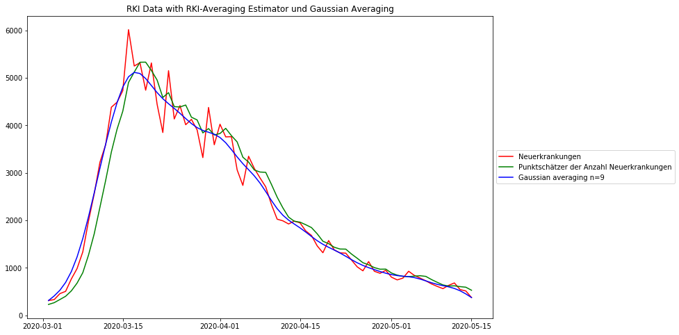
Both averaging methods eliminate the worst noise, the Gaussian smoothing more than the RKI method. It can be observed that the RKI smoothing has a bias, shifting the data 3-4 data points to the right. One possible problem of the strong Gaussian smoothing is that the peak appears to be lower than with the RKI estimator. But apart from the higher data fidelity the position of the maximum is much better preserved than with the RKI estimator.
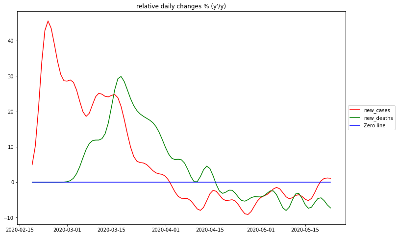
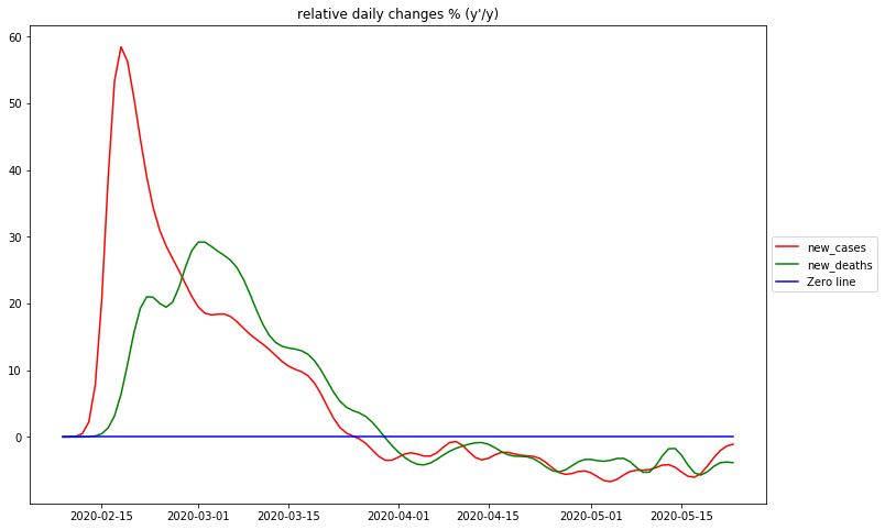
Displaying the relative changes
The diagram shows the relativ changes per day for the German RKI data. As discussed above these data describe the type of growth taking place.
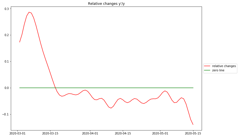
There are essentially 3 identifyable phases: The first ascending phase before the peak is at the very beginning of the epidemic. Due to the fact that there are no numbers available in this dataset before march 1, 2020, it is doubtful whether this is an artefact of data processing or a real phenomenon. Other more complete datasets suggest, that the epidemic starts at the maximum relative change – corresponding to maximal reproduction rate at the beginning.
The biggest surprise is that there is no phase of exponential growth, as can be seen from the rather sharp peak. For eponential growth this would have to be a plateau. Instead the graph drops rather sharply, resembling a straight line and crosses 0 directly after march 16, 2020. This is the day, when the original daily case data reach their maximum value – this is the day when the “curve is flattened”, from then on the numbers of new cases are declining. From the previous discussion these observations strongly suggest, that the rising part of the epidemic curve is a rather strict bell curve.
It must be stated here that the complete process of “flattening the curve” and decreasing new cases has been achieved before the strict lockdown had been installed in Germany (at march 23, 2020).
After the peak of cases the relative change in Germany has remained strictly below 0. Clearly the curve is no longer decreasing in the linear way it did before crossing 0. This means that the rest of the curve is not a bell curve any more. The best simple approximation can be done with a constant value slightly below 0. This corresponds to a negative exponential growth, i.e. exponential decay of the case data.
Estimating the R-Value
A key element in the discussion of an epidemic is the so-called reproduction value R, i.e. the number of persons that are infected by one previously infected person. This also plays an important role when modelling the spread of the epidemic. The Robert Koch Institute has developed an algorithm to measure the R-Value directly from the case numbers. Here I want to discuss their estimator and relate it to my approach of analyzing the data.
The following section may be mathematically challenging, but it is necessary in order to justify my claim that the resulting formula is indeed a valid estimator of the reproduction number R. Only those who have doubts about the validity of my formula at the end of this section will need to read this fully.
The concept of the Robert Koch Institute to estimate the time variant R-Value is to take the ratio of the smoothed case data  , with numerator and denominator 4 days apart:

Both their smoothing operation as well as the ratio between the smoothed data shift the result to the right, i.e. to later times. In my view this this is incorrect and distorts the result, because
- Smoothing should never imply any time shifts of data
- When the reproduction number R is the cause of the increase or decrease of case/incident data values, that cause must never be in the future. At best, R is at the same time as the change that it causes. This philosophy is represented by the derivative of the function, where change is measured directly at the data point itself.
It can be easily demonstrated with their published data, that the date of the “flat” curve (16.3.2020, maximum of “nowcasted” daily infection cases – “Datum des Erkrankungsbeginns”) does not coincide with R crossing of the value-equals-1-line for the RKI data. This crossing is reported 5-6 days later (depending on the degree of smoothing – “Punktschätzer der Reproduktionsrate/Punktschätzer des 7 Tage R-Werts”).
Therefore I modify the expression to make it time symmetrical (doing this only changes the time shift, not the function values), and use the n times smoothed data array  as the data source :

Taking the (natural) log of this:

Taking  as the source for computing the derivative, then

Due to the smoothness of the underlying data the 5 values between  and
and  can safely be assumed to be on a straight line, so that taking the difference between the values at the points (t+2) and (t-2) is approximately twice the value difference between (t+1) and (t-1). Therefore:

and finally

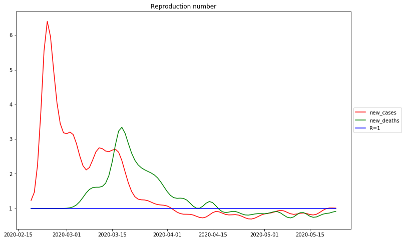
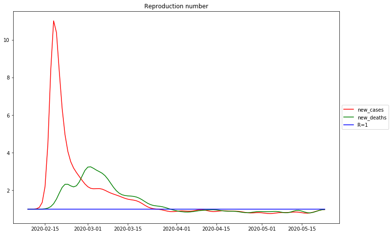
The following diagram shows the computed  and simultaneously the published RKI data, shifted left by 5 days:
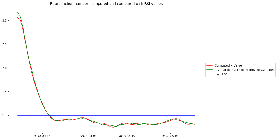
From this diagram the following conclusions can be drawn:
- -The curve based on Gaussian smoothing and derivative reproduces precisely the R-value of the Robert Koch Institute. Again it shows, that the R-value is below 1 at march 17, 2020, 1 week befor the lockdown in Germany.
- The easy-to-understand relative change of case data is closely related to the R-value:
- The R-value visualizes better the epidemiological cause – one person infecting R others
- The relative change is more suitable to model and predict, because it relates to known mathematical concepts.
- The R-value of the Robert Koch Institute is time shifted to the future by 5 days, thus violating the causality principle, and drawing a more pessimistic picture than necessary.
- The R-Value between its peak and its crossing the value 1 line also resembles a curve close to a straight line, and it crosses the value 1 line is at the same position as the zerocrossing of the relative change value. Therefore for qualitative evaluations and demonstrations the more well-known R-value is used. For model based predictions the relative change function is more suitable.
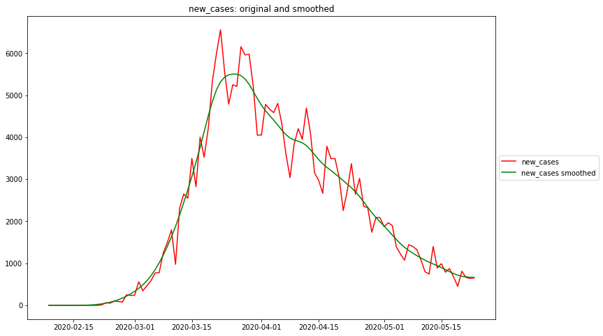
Course of Germany
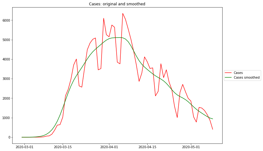
For the sake of comparability, all the following data are based on the John-Hopkins Dataset.
As it can be easily seen by comparing with the above German data, the quality of the John-Hopkins data is much worse that those from the Robert Koch Institute:
- the case values of John-Hopkins are all time shifted to the future, because the reporting date is used and not the date of the beginning of the disease.
- there is no correction for the reporting patterns (much less cases reported during weekends)
All evaluations based on confirmed case values have the weakness of not considering the true — unknown — case values, but only the diagnosed ones. The diagnosed case values depend very much on the numbers of tests performed. The places and times with higher test rates have a bias towards higher incidence rates.
This is one reason, why some researchers only rely on death rates, because these numbers are the most reliable ones.
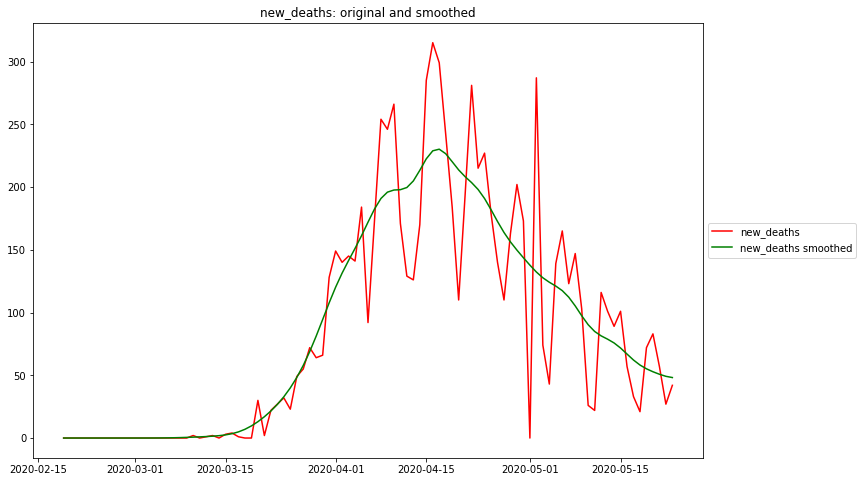
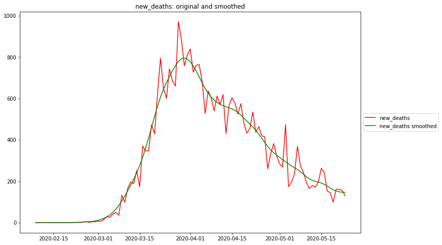
Maximum rel. change of new_cases: 2020-02-24
Flat curve of new_cases: 2020-04-02
Maximum rel. change of new_deaths: 2020-03-18
Flat curve of new_deaths: 2020-02-23
Date R0 of new_cases: 2020-02-24
R<1 of new_cases: 2020-04-02
Date R0 of new_deaths: 2020-03-18
R<1 of new_deaths: 2020-02-23
Course of Italy
Maximum rel. change of new_cases: 2020-02-18
Flat curve of new_cases: 2020-03-25
Maximum rel. change of new_deaths: 2020-03-02
Flat curve of new_deaths: 2020-03-29
Date R0 of new_cases: 2020-02-18
R<1 of new_cases: 2020-03-25
Date R0 of new_deaths: 2020-03-02
R<1 of new_deaths: 2020-03-29
Course of New York
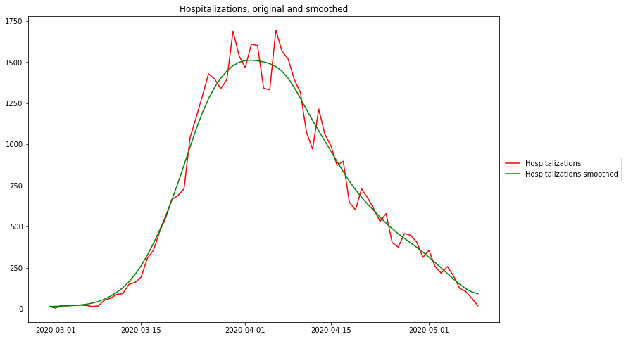
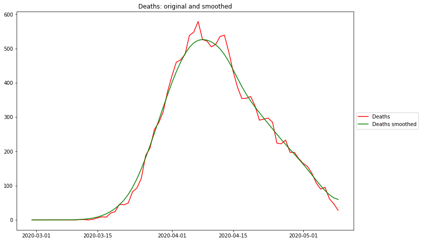
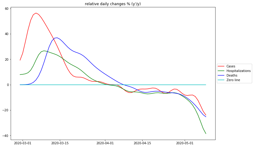
Maximum rel. change of Cases: 3/6/20
Flat curve of Cases: 4/5/20
Maximum rel. change of Hospitalizations: 3/9/20
Flat curve of Hospitalizations: 4/1/20
Maximum rel. change of Deaths: 3/14/20
Flat curve of Deaths: 4/8/20
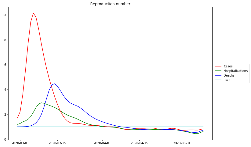
Date R0 of Cases: 3/6/20
R<1 of Cases: 4/5/20
Date R0 of Hospitalizations: 3/9/20
R<1 of Hospitalizations: 4/1/20
Date R0 of Deaths: 3/14/20
R<1 of Deaths: 4/8/20
Interpretation of the diagrams
The raw data are extremely “noisy”, i.e. there are days on which no case numbers occur at all (where there should be). The weekly recording patterns are also clearly visible. The smoothed curves reflect the intuitively expected course quite well.
The diagrams of the relative changes of both Germany and New York show that in both areas there was no phase during which there was unrestricted exponential growth. If there was, there would be a plateau at the absolute maximum of the curves of relative changes.
The curve to the left of the maximum of the measured data is in most cases well represented by a bell curve, i.e. the curve of the relative changes resp. the R-values curve is well approximated by a descending straight line between its maximum and its crossing of the  line. As can be seen from the comparison with the data from the Robert-Koch institute, the deviations from the straight line in the German case numbers can be explained by the poor data quality of the John Hopkins data set.
Very noticeable in the case numbers of New York is the clear “kink” of the relative changes: While at first the relative changes decrease sharply, on day 20 (20.3.2020) a phase of much smaller decrease begins, with the meaning that the decrease in new case numbers is much weaker than before. A possible explanation for this phenomenon would be a systematic and significant increase in the number of tests, with the result that higher percentages of cases are recorded every day.
To the right of the maximum of the measured data, i.e. in the range of falling values, the relative changes are consequently all negative. Whether this range is better approximated by a constant (exponential drop) or by a very gently falling straight line (bell curve) or an even more complex function, probably cannot be said in general terms, but perhaps a clearer picture will emerge if more countries are studied.
However, it is irrelevant in this respect, because the most important thing for a safe end to the epedemic is that the R-Values remain below 1, the further, the faster this happens.
Conclusions
The representation of the course of the epedemia with the help of the transformation allows to evaluate visually the essential phases of the course of the epedemia and even to make prognoses without an “obscure” model. The English model of the Imperial College, which was the basis of most initial prognoses, apparently has 15000 lines of code, which nobody can understand after the resignation of the previous project leader Neil Ferguson, and the quality of which appears doubtful after vastly erroneous prognoses.
The estimators for smoothing and for calculating the derivative can be applied for calculating the important reproduction number R, thus giving the epidemiological community a solid mathematical framework that has proven its validity for decades.
The initial increase to the maximum of relative changes resp. R-values is irrelevant and an artifact of smoothing. On closer examination, this increase is where the original case counts are still close to 0, therefore before the actual beginning of the epidemic. This means, that the spread of the virus is largest at the very beginning of the epidemic, and the initial rate of change resp. is decisive for the further course
By approximating the curve after the maximum with a straight line, the expected position of the zero crossing and thus the expected time of reaching the “flat curve” can be predicted. The quality of the prediction depends very much on the quality of the data, and obviously also on the continuity of the behaviour of the population. With the available data, it is very easy to make and test “ex-post” predictions. This prediction cannot be done with the empirical R-values, because their curve is not a straight line in the case of a “bell model”.
In any case, this representation is suitable for checking official statements about the policy-critical reproduction factor .
Initially translated with www.DeepL.com/Translator (free version)